


Google Sheets' bar graphs can turn complex data into clear, colorful bars that reveal trends and patterns at a glance. You can make a bar graph in Google Sheets by using any of the following methods:
- Making a bar graph in Google Sheets, using its chart editor;
- Making a bar graph with your Google Sheets data, using Softr.
Making a Bar graph in Google Sheets using the Chart Editor
With Google Sheets’ chart editor, you can create bar graphs in around three minutes, for free, with the option of tweaking the graph’s titles, labels, and style.
Step 1: Select the data range
First, highlight the data you’d like to use to create the bar graph.

Step 2: Open the chart editor panel
Go to the "Insert" menu at the top of your Google Sheet and then select “Chart” to open the chart editor panel.

Step 3: Choose a chart type
In the chart editor panel, click on the arrow under “Chart type.” There, under the Bar heading, click on “Bar chart.” This will generate the graph in your sheet.

Step 4: Customize your bar graph
Now, you have the option to customize your bar graph, so you can change its colors, labels, and more. To do so, follow the next steps.
Step 4.1: Access the customize tab of the chart editor
To start the customization process, go to the “Customize” tab of the chart editor.

Step 4.2: Customize Chart style
In the Customize tab of the chart editor, open the Chart style menu. There, you can change the chart’s background color, font, and border color.

Step 4.3: Customize the titles
You can now choose to customize four of the titles of your bar graph: title, subtitle, horizontal axis title, and vertical axis title. To choose which one you want to change, in the Customize tab of the chart editor, open the Chart & axis titles menu. There, you can change the text of the title, font size, format, and color.

Step 4.4: Customize the series
To customize the series of your bar graph, in the Customize tab of the chart editor, open the Series menu, where you can choose which series you want to change. Once you’ve done so, you can change each of the line’s color, fill color, dash type, opacity, and thickness.

Step 4.5: Customize the legend
Next, in the Customize tab of the chart editor, open the Legend menu to customize the legend of your bar graph. To choose where you want to position it, choose any of the opens in the dropdown menu under Position. Then you can customize the legend’s font, size, format, and color.

Step 4.6: Customize the axis
In the chart editor, specifically in its Customize tab, you can customize the horizontal and/or vertical axis of your bar graph. After you open the respective menu of the axis you want to customize, you can customize its font, size, format, and color.

Step 4.7: Customize the gridlines and ticks
Also in the Customize tab of the chart editor, you can customize your bar graph’s gridlines and ticks by opening the respective menu. There, you can choose to customize the horizontal and/or vertical axis. Once you’ve done so, you’re presented with the following input fields:
- Major spacing type and minor spacing type refer to the type, which can be either step or count, for the spacing type for the gridlines and tick marks.
- Major steps and minor steps refer to the distance between the gridlines and tick marks, which can be either automatic, none, or a number between one and ten.

Step 5: You’ve created a bar graph!
Congratulations! You’ve created a bar graph. Optionally, by clicking on the three docs on the graph’s top right corner, you can choose to download, publish, copy, or move it to its own sheet.

Making a bar graph with your Google Sheets data, using Softr
You can also use Softr, a no-code platform, to create a bar graph that uses your data stored in Google Sheets. The bar graph you can create with Softr is vastly more customizable than the one you can create solely using Google Sheets.
Step 1: Log in to Softr or create an account
First, you will need to log in to Softr. If you don’t have an account, you can sign up for Softr for free.

Step 2: Create a new Application
With your Softr account set up, it's time to create a new application where your graph will be housed.
On your Softr dashboard, locate and click on the "New Application" button.

Step 3: Select Blank application
Click on “Blank application” In the pop-up window that appears.

Step 4: Click on “Create application”
On the new page, click on “Create application".

Step 5: Open the blocks sidebar
Click on the + button on the top right corner of your screen to open the blocks sidebar.

Step 6: Add Bar chart
Now that the page has no blocks, click on “Add your first block.” This will open a sidebar on the right side of your screen, where you can search for a pre-made block called “Bar chart.”

Step 7: Add a data source
After clicking on your newly created block, in the SOURCE tab, you will notice that you need to add a data source so that Softr can fetch your data from Google Sheets. To do so, follow the next steps.

Step 7.1: Select Google Sheets as a data source
As your data is stored in Google Sheets, select “Google Sheets” and click on “Continue.”

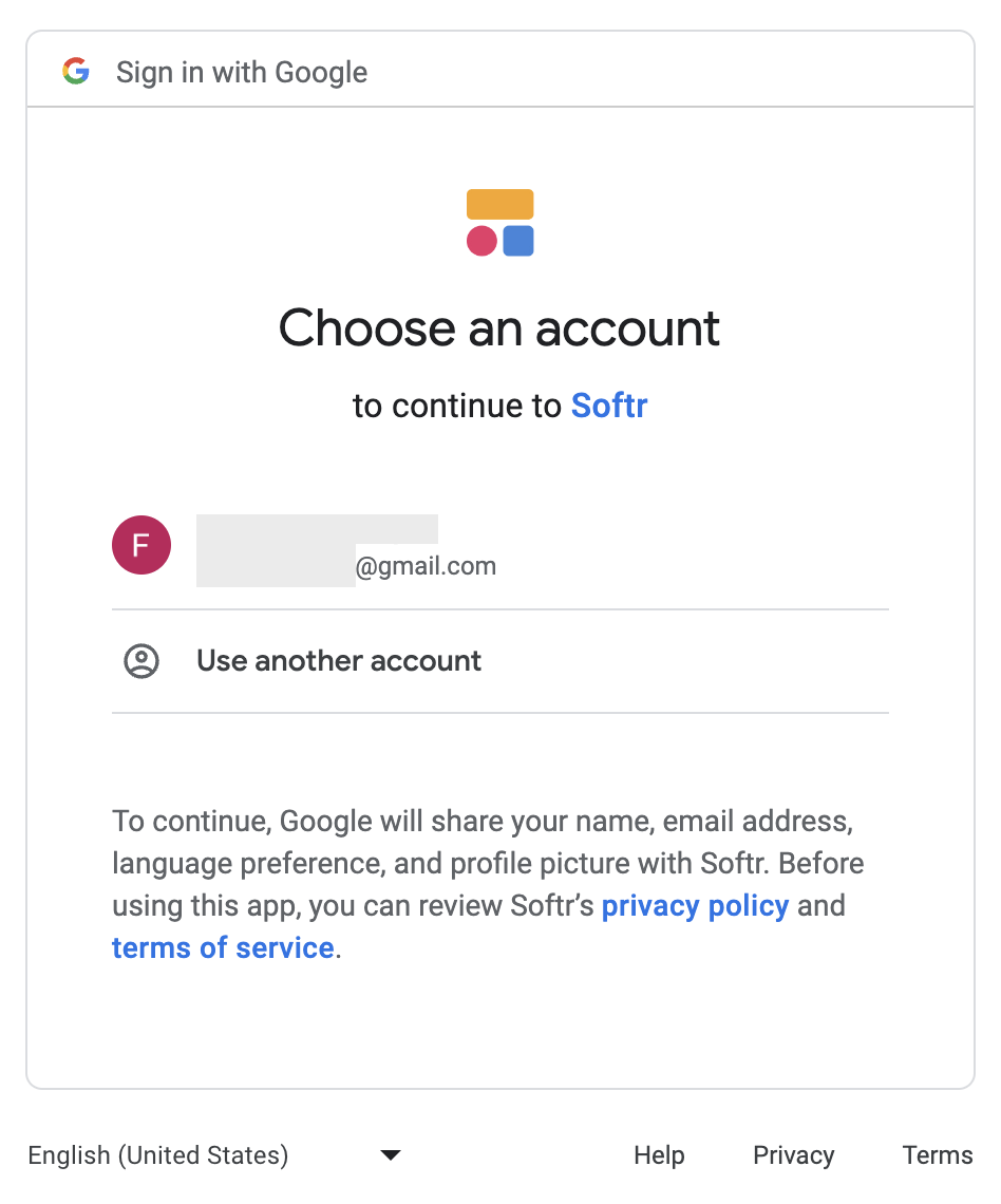
Step 7.2 Select a Google Account
A new window or tab will open for you to login to or select your Google Account.
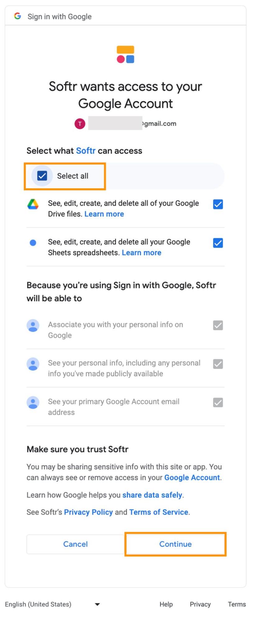
Step 7.3 Grant additional access
In this step, you’ll need to grant Softr access to a set of features. Click on "Select all" and then hit “Continue."
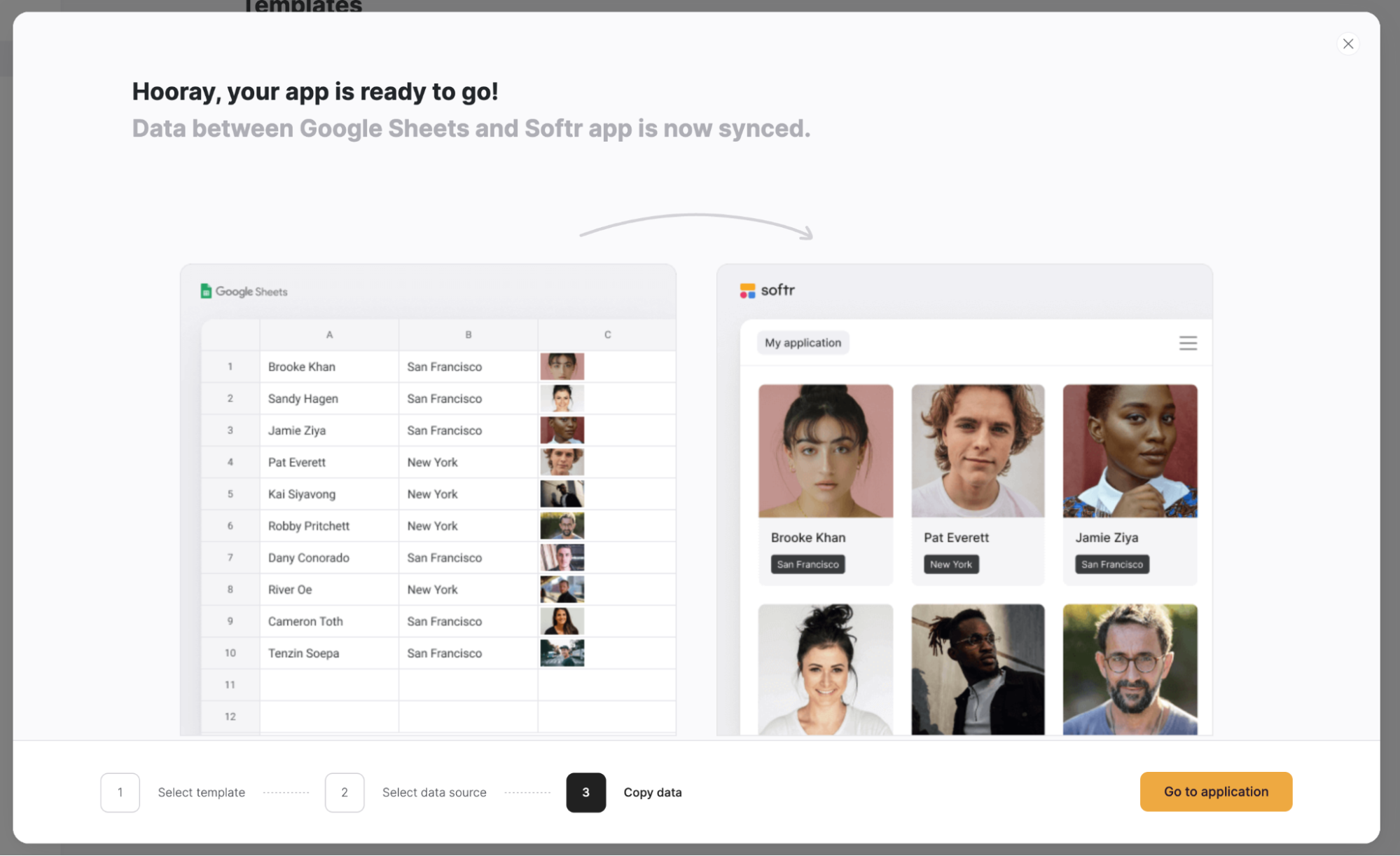
Step 7.4: Go to your app
Now that your Google account is connected with Softr, click on “Go to application.”
Step 8: Indicate the Google Sheets file where your data is stored
In order for the job application tracker to display the data you have stored in your Google Sheets file, you need to indicate where exactly that data is located. To do so, click on the list with columnar sliding cards block, in order to open a sidebar on the right side of your screen. There, you will need to select the spreadsheet and the sheet where your data is by clicking on the "Document" and "Sheet" options.

Step 9: Customize the title and subtitle
Next, by clicking on the FEATURES tab, you can choose a new title and subtitle for your bar graph. Additionally, by clicking on the icon next to “Title” and “Subtitle,” you can change their font size, color, line weight, padding, and more.

Step 10: Style your bar graph
Softr allows you to style your bar graph in a few ways. To customize the padding at the top and the bottom of your bar graph, go to the STYLES tab and adjust either padding under the PADDINGS & MARGINS heading.
Additionally, by scrolling down in the STYLES tab, you can find the General section. There, you can customize the bar graph’s background color, as well as the color, type, and thickness of the borders.

Step 11: Adjust access permissions
You can choose to control who has access to your bar graph. You can allow either all users, logged-in users, or non-logged-in users. You can adjust this setting in the VISIBILITY tab.

Step 12: Save your changes
Once you've configured your bar graph, you need to save your changes, so that it’s accessible to other users. You can do so by clicking on “Publish” in the top right corner of your screen.

Step 13: You’ve created a bar graph
By combining Google Sheets and Softr, you’ve created a highly customizable bar graph that you can use to visualize your data.

What is Softr
Softr is the easiest way to turn your data into powerful business apps—no code required. Connect to your spreadsheet or database, customize layout and logic, and share with your team or clients.
Join 700,000+ users worldwide, building client portals, internal tools, CRMs, dashboards, project management systems, inventory management apps, and more—all without code.
Join 700,000+ users worldwide, building client portals, internal tools, CRMs, dashboards, project management systems, inventory management apps, and more—all without code.
Get started free

Silvia Gituto


Categories


